installation
Follow the steps below to setup your site template:
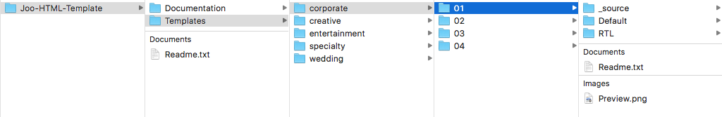
Downloading the Template
Once you have downloaded the zip file from Themeforest, unzip it using your standard zip software. When it has finished you should have a folder with the following files & directories inside.
| Folder | Content | Sub-Folders |
|---|---|---|
| Documentation | contains template's documentation. | ---- |
| Templates | contains all 15 full niche templates for using. |
|
| Readme.txt | contains instructions for using template. | ---- |
- Connect to your website host, using some of many FTP clients, for example FileZilla.
- After opened the template folder you will need to upload any niche template you need, for example if you need to upload (corporate 01) template, just go to
Templates > corporate > 01 > Defaultand upload all content within this folder or specific HTML files as per your need to your website server folder.
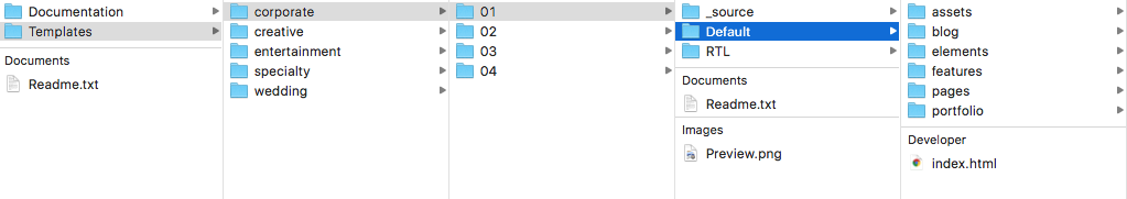
- Also you can upload
Templates > corporate > 01 > RTLfolder content, which this is the RTL/Arabic version of any niche template you have. - After you uploaded the template you want, you can start adding your content/images and and do what you need.
HTML Structure
This template using Bulma Framework which is a free CSS framework based on Flexbox. And the HTML structure is very simple and easy to customize. Here is the sample for your reference:
<!DOCTYPE html>
<html lang="en" class="no-js no-svg">
<head>
    <meta charset="UTF-8">
    <meta name="author" content="">
    <meta name="description" content="">
    <meta name="keywords" content="">
    <title>The Page Title</title>
    <link rel="stylesheet" href="css/styles.css">
</head>
<body>
	<div id="site-wrap" class="site">

		<header id="header" class="site-header">
			<nav id="site-navigation" class="main-navigation left">...</nav>
		</header>

		<section>
            <div class="columns">
              <div class="column">
                First column
              </div>
              <div class="column">
                Second column
              </div>
              <div class="column">
                Third column
              </div>
            </div>
        </section>

        <footer id="footer" class="site-footer">
        	...
        </footer>

    </div>
    <script src="js/scripts.js"></script>
</body>
</html>
logo settings
The logo image can be found inside header container, so just upload you site logo image inside Templates > corporate > 01 > Default > assets > images > logo
                        <div id="header-logo" class="site-logo ">
		                  <div id="logo-inner" class="site-logo-inner">
		                    <a href="./index.html">
		                      <img alt="Joo - Niche Multi-Purpose HTML Template" src="../assets/images/logo/logo.png"></a>
		                  </div>
		                  <!-- #logo-inner -->
		                </div>
		                <!-- #header-logo -->
images & favicon
Images
Joo template downloaded package does not contain images which are there in our online demo. We are using placeholder images instead of real images. You will see the image code as mentioned below. You can replace placeholder image
url with your image url like ./assets/images/Image_URL.png
<img src="Image_URL" alt="image alt text">
Favicon
To change the favicon images of your site, just replace all images inside ./assets/images/favicons folder with your site logo images.
                        <!-- favicon -->
<link rel="apple-touch-icon" sizes="57x57" href="../assets/images/favicons/apple-touch-icon-57x57.png">
<link rel="apple-touch-icon" sizes="60x60" href="../assets/images/favicons/apple-touch-icon-60x60.png">
<link rel="apple-touch-icon" sizes="72x72" href="../assets/images/favicons/apple-touch-icon-72x72.png">
<link rel="apple-touch-icon" sizes="76x76" href="../assets/images/favicons/apple-touch-icon-76x76.png">
<link rel="apple-touch-icon" sizes="114x114" href="../assets/images/favicons/apple-touch-icon-114x114.png">
<link rel="apple-touch-icon" sizes="120x120" href="../assets/images/favicons/apple-touch-icon-120x120.png">
<link rel="apple-touch-icon" sizes="144x144" href="../assets/images/favicons/apple-touch-icon-144x144.png">
<link rel="apple-touch-icon" sizes="152x152" href="../assets/images/favicons/apple-touch-icon-152x152.png">
<link rel="apple-touch-icon" sizes="180x180" href="../assets/images/favicons/apple-touch-icon-180x180.png">
<link rel="icon" type="image/png" sizes="32x32" href="../assets/images/favicons/favicon-32x32.png">
<link rel="icon" type="image/png" sizes="16x16" href="../assets/images/favicons/favicon-16x16.png">
<link rel="shortcut icon" href="../assets/images/favicons/favicon.ico">
changing fonts
In order to use google fonts, you need to visit
Google Fonts Library and follow the instructions on how to get a new font. After you have decided on the styles of the font that you want to load, google fonts will provide you with a code to copy as the first element in the
head of your HTML document. The code would look similar to this:
<link href="https://fonts.googleapis.com/css?family=Kalam:700|Oswald:400,500,700|Open+Sans:300,400&v=1556900997064" rel="stylesheet">
Go to assets > css > custom.css and edit this file with you new font like that:
                        body {
					      font-family: "Oswald", sans-serif;
					      font-weight: 400;
					    }
Note use this file to add or override any other styles. DON'T EDIT TEMPLATE CSS/SCSS FILES DIRECTLY, JUST USE THIS FILE.
header layouts
You can choose between a lot of headers layouts while creating your Pages. The list of various header layouts & its descriptions are provided below for your reference:
Note to change header layout, you just need to add header layout class to body classes without update any HTML markup, for example:
<body class="header-sticky hide-on-scroll header-menu-with-buttons menu-center">
Logo Center
<body class="header-logo-center">
Live Preview
Logo Left
<body class="header-logo-left">
Live Preview
Logo right
<body class="header-logo-right">
Live Preview
Logo & Menu Center
<body class="header-logo-center-menu-center">
Live Preview
Side Navigation
<body class="header-side-navigation side-left">
Live Preview
Hamburger Menu
<body class="header-hamburger-menu slide-right">
Live Preview
Sticky Navigation
<body class="header-sticky show-on-scroll">
Live Preview
Top Bar
<body class="header-logo-left header-topbar topbar-default">
Live Preview
See more layouts
header styles
You can choose between a lot of headers styles while creating your Pages. The list of various header styles & its descriptions are provided below for your reference:
Note to change header style, you just need to add header layout class to body classes without update any HTML markup, for example:
<body class="header-menu-with-icons menu-center header-transparent">

Header Transparent
<body class="header-transparent">
Live Preview
Header Background Color
<body class="header-background primary-color">
Live Preview
Header Center Overlay
<body class="header-center-overlay">
Live Preview
See more styles
content layouts
# Container
The .container class can be used in any context, but mostly as a
direct child of either:
.navbar.hero.section.footer
The containers
width for each
breakpoint is the result of: $device - (2 * $gap). The $gap variable has a default value of
32px but can be modified.
This is how the container will behave:
- on
$desktopit will have a maximum width of 960px. - on
$widescreenit will have a maximum width of 1152px. - on
$fullhdit will have a maximum width of 1344px.
The values 960, 1152 and 1344 have been chosen because they are divisible by both 12 and 16.
                        <div class="container">
                          <div class="notification">
                            This container is <strong>centered</strong> on desktop.
                          </div>
                        </div>
Fluid container
If you don't want to have a maximum width but want to keep the 32px margin on the left and right sides, add the is-fluid modifier:
                        <div class="container is-fluid">
                          <div class="notification">
                            This container is <strong>fluid</strong>: it will have a 32px gap on either side, on any
                            viewport size.
                          </div>
                        </div>
Breakpoint containers
With the two modifiers .is-widescreen and .is-fullhd, you can have a
fullwidth container
until those specific breakpoints.
# Level
The structure of a level is the following:
-
level: main containerlevel-leftfor the left side-
level-rightfor the right sidelevel-itemfor each individual element
In a level-item, you can then insert almost
anything you want: a title, a button, a text input, or just simple text. No matter what elements you put inside a Bulma level, they will always be
vertically centered.
                        <!-- Main container -->
                        <nav class="level">
                          <!-- Left side -->
                          <div class="level-left">
                            <div class="level-item">
                              <p class="subtitle is-5">
                                <strong>123</strong> posts
                              </p>
                            </div>
                            <div class="level-item">
                              <div class="field has-addons">
                                <p class="control">
                                  <input class="input" type="text" placeholder="Find a post">
                                </p>
                                <p class="control">
                                  <button class="button">
                                    Search
                                  </button>
                                </p>
                              </div>
                            </div>
                          </div>

                          <!-- Right side -->
                          <div class="level-right">
                            <p class="level-item"><strong>All</strong></p>
                            <p class="level-item"><a>Published</a></p>
                            <p class="level-item"><a>Drafts</a></p>
                            <p class="level-item"><a>Deleted</a></p>
                            <p class="level-item"><a class="button is-success">New</a></p>
                          </div>
                        </nav>
# Section
Use sections as
direct children of body.
                        <body>
                          <section class="section">
                            <div class="container">
                              <h1 class="title">Section</h1>
                              <h2 class="subtitle">
                                A simple container to divide your page into <strong>sections</strong>, like the one you are currently reading
                              </h2>
                            </div>
                          </section>
                        </body>
You can use the modifiers is-medium and is-large to change the
spacing.
# Columns
Building a columns layout with Bulma is very simple:
- Add a
columnscontainer - Add as many
columnelements as you want
Each column will have an equal width, no matter the number of columns.
First column
Second column
Third column
Fourth column
                        <div class="columns">
                          <div class="column">
                            First column
                          </div>
                          <div class="column">
                            Second column
                          </div>
                          <div class="column">
                            Third column
                          </div>
                          <div class="column">
                            Fourth column
                          </div>
                        </div>
content elements
Joo template have 50+ Unique Elements Ready to use within your page easily for quickly start build you site.
Full List of ElementsSee some of this elements using below:
# Quickview
Quickview title
                        <div id="quickviewDefault" class="quickview">
                          <div class="quickview-header">
                            <p class="title">Quickview title</p>
                            <span class="delete" data-dismiss="quickview"></span>
                          </div>

                          <div class="quickview-body">
                            <div class="quickview-block">
                              ...
                            </div>
                          </div>

                          <div class="quickview-footer">

                          </div>
                        </div>

                        <button class="button is-primary" data-show="quickview" data-target="quickviewDefault">Show quickview</button>
# Google Maps
We use a free service Snazzy Maps which provide a Map Build tool with a free styles, then You can embed google map into your page like below:
<iframe src="https://snazzymaps.com/embed/113147" width="100%" height="500px" style="border:none;"></iframe>
build your map snazzy maps homepage
# Code Highlight
                        <!DOCTYPE html>
                        <html lang="en">
                        <head>
                            <title>The Page Title</title>
                            <link rel="stylesheet" href="css/styles.css">
                        </head>
                        <body>
                            <div class="columns">
                              <div class="column">
                                First column
                              </div>
                              <div class="column">
                                Second column
                              </div>
                              <div class="column">
                                Third column
                              </div>
                            </div>
                            <script src="js/scripts.js"></script>
                        </body>
                        </html>
You can Highlights inline code as well, not just code blocks like styles.css.
# Form Fields
The following form controls classes are supported:
.label.input.textarea.select.checkbox.radio.button.help
Each of them should be wrapped in a .control container.
When combining several controls in a
form, use the .field class as a
container, to keep the spacing consistent.
This username is available
This email is invalid
footer layouts
You can choose between a lot of footer layouts while creating your Pages. The list of various footer layouts & its descriptions are provided below for your reference:
Note to change footer layout, you just need to add footer layout class to body classes without update any HTML markup, for example:
<body class="footer-default footer-widgets">
Footer Default
<body class="footer-default">
Live Preview
Footer Widgets
<body class="footer-widgets">
Live Preview
Footer Top
<body class="footer-widgets">
Live Preview
Footer Bottom
<body class="footer-widgets">
Live Preview
See more layouts
footer styles
You can choose between a lot of footer styles while creating your Pages. The list of various footer styles & its descriptions are provided below for your reference:
Note to change footer style, you just need to add footer style class to body classes without update any HTML markup, for example:
<body class="footer-background primary-color">
Footer Background Color
<body class="footer-background primary-color">
Live Preview
Footer Dark Color
<body class="footer-background dark-color">
Live Preview
Footer Reveal
<body class="footer-background dark-color footer-reveal">
Live Preview
See more styles
CSS styles
You can edit your site style easily with Gulp development system below, or you can override the styles using this file: assets > css > custom.css
Note use this file to add or override any other styles. DON'T EDIT TEMPLATE CSS/SCSS FILES DIRECTLY, JUST USE THIS FILE.
For example if you want to change template color, just do that:
/*
 * ::::::::::: Custom Styles :::::::::::
 * Note: use this file to add or override any other styles.
 * DO NOT EDIT TEMPLATE CSS/SCSS FILES DIRECTLY, JUST USE THIS FILE.
 */

.is-primary {
    color: #000;
}
Show pageloader on load, so to add pageloader for any page just do that:
- add this html code between 'body' tag in your page:
<div class="pageloader is-active"><span class="title">Loading</span></div> - add this class 'active-pageloader' to body tage like that:
<body class="active-pageloader">...</body>
JavaScript scripts
You can edit your site scripts easily with Gulp development system below, or you can override the scripts using this file: assets > js > custom.js
Note use this file to add or override any other styles. DON'T EDIT TEMPLATE JS FILES DIRECTLY, JUST USE THIS FILE.
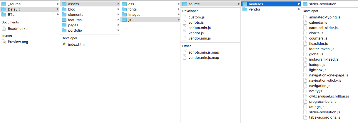
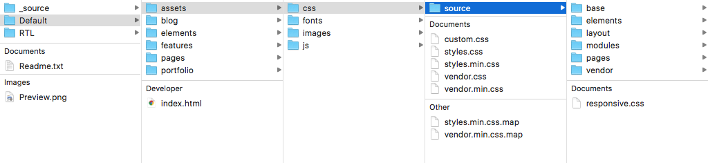
Any script using with the template you will found it in assets > js > source > modules which you can see what are the options for using and then override it with custom.js file.
slider revolution
Revolution slider included for all templates, you can found it here: assets > js > source > modules > slider-revolution folder.
And below is the HTML structure for using it:
<!-- ******************* -->
        <!-- BEGIN SLIDER MARKUP -->
        <!-- ******************* -->
        <div class="rev_slider_wrapper">

            <!-- the ID here will be used in the JavaScript below to initialize the slider -->
            <div id="rev_slider_1" class="rev_slider" data-version="5.4.5" style="display:none">

                <!-- BEGIN SLIDES LIST -->
                <ul>

                    <!-- MINIMUM SLIDE STRUCTURE -->
                    <li data-transition="fade">

                        <!-- SLIDES MAIN BACKGROUND IMAGE -->
                        <img src="assets/images/notgeneric_bg3.jpg" alt="Sky" class="rev-slidebg">

                    </li>

                    <!-- MINIMUM SLIDE STRUCTURE -->
                    <li data-transition="fade">

                        <!-- SLIDES MAIN BACKGROUND IMAGE -->
                        <img src="assets/images/notgeneric_bg5.jpg" alt="Ocean" class="rev-slidebg">

                    </li>

                </ul><!-- END SLIDES LIST -->

            </div><!-- END SLIDER CONTAINER -->

        </div><!-- END SLIDER CONTAINER WRAPPER -->
Full Documentation
contact form
Ajax Contact Form
We use a free service BASIN which provide a Simple form backend for designers and developers, which you can collect submission data and track conversions with no backend coding required. check simple code below:
                    <form accept-charset="UTF-8" action="https://usebasin.com/f/3587049dbc33" enctype="multipart/form-data" method="POST">

                      <label for="email-address">Email Address</label>
                      <input type="email" id="email" name="email" required>

                      <textarea rows="4" cols="50" name="comment" required>
                      </textarea>

                      <button type="submit">Submit</button>

                    </form>
BASIN homepage
gulp development
We use our JO Gulp Workflow system for develop this template, which is An organized front-end workflow for Jozoor Templates development using gulp.
You can found this workflow here: Templates > corporate > 01 > _source folder which have 2 folders:
_developmentfor default LTR development_development_RTLfor RTL/Arabic development
Features
- Organized & splitting tasks files
- Using gulp-load-plugins
- Define tasks options & paths from one file
- Using Yarn to get dependencies
- Preview server with BrowserSync
- Cleans up file directories
- Plumber to handle gulp exceptions
- Sourcemaps for sass & js
- Sass compile with docs
- Js modules & uglify
- Nunjucks templates
- Automagically inject css/js files
- Prettify html files
- Image optimization
- Generate favicons
- Concat css/js files
- & more, take a look at the gulp plugins used in package.json
Gulp Tasks Structure
This is gulp folder structure:
config.jsfile : to define tasks optionspaths.jsfile : to define all paths for tasksbasefolder : contain base tasksdefaultfolder : contain common tasks for developmentbuildfolder : contain build tasks for production
                    gulp
├── config.js
├── paths.js
└── tasks
    ├── base
    │   ├── clean.js
    │   ├── serve.js
    │   ├── vendor.js
    │   └── watch.js
    ├── build
    │   ├── css.js
    │   ├── fonts.js
    │   ├── html.js
    │   ├── images.js
    │   └── scripts.js
    └── default
        ├── fonts.js
        ├── images.js
        ├── nunjucks.js
        ├── sass.js
        └── scripts.js
Getting Started
npm install --global yarn
- In terminal/command line,
cdinto your project directory - Clone this workflow
git clone https://github.com/mohamdio/jo-gulp-workflow.git .
- Install front-end and Gulp dependencies
yarn install
- After all done installing, you can run tasks
gulpto run default tasks for developmentgulp buildto build your project for productiongulp helpto get a listing of available tasks
Available Tasks
| Task Name | Subtasks | Description |
|---|---|---|
clean |
clean:cache - clean:prod |
clean dest folders (dev & prod) & caches :: base/clean.js |
vendor |
vendor:clean - vendor:bulma:sass - vendor:js - vendor:css - vendor:fonts |
dest all vendor dependencies to source folder :: base/vendor.js |
fonts |
--- | copy all fonts to dev folder :: default/fonts.js |
sass |
sass:compile - sass:doc - sass:cssRebaseUrl |
compile sass files with docs & rebase css url :: default/sass.js |
js |
js:copySrc |
uglify js files & copy source js files to dev folder :: default/scripts.js |
images |
images:minify - images:favicons |
minify images & generate favicons :: default/images.js |
nunjucks |
nunjucks:render - nunjucks:inject |
render nunjucks files & inject css/js files :: default/nunjucks.js |
serve |
serve:prod |
start server & open browser for dev or prod mode :: base/serve.js |
watch |
--- | start gulp watch for tasks (bower - sass - nunjucks - js) :: base/watch.js |
build |
--- | main build task for prod mode |
| --- | build:fonts |
copy fonts to prod folder :: build/fonts.js |
| --- | build:css |
rebase url/remove unused selectors/strip comments/beautify/concat/minify :: build/css.js |
| --- | build:js |
copy js files to prod folder :: build/scripts.js |
| --- | build:images |
copy images to prod folder :: build/images.js |
| --- | build:html |
copy & prettify html files and inject minified css/js files :: build/html.js |
Folders Structure
buildfolder : contain dest foldersdevfor development &prodfor productiongulpfolder : contain all gulp tasks filesnode_modulesfolder : contain all front-end and gulp dependenciessourcefolder : contain all source filesgulpfile.jsfile : define gulp tasks for default & buildpackage.jsonfile : define front-end and gulp dependencies- other files for the repo.
jo-gulp-workflow
├── build
│   ├── dev
│   │   ├── assets
│   │   └── index.html
│   └── dist
│       ├── assets
│       └── index.html
├── gulp
│   ├── config.js
│   ├── paths.js
│   └── tasks
│       ├── base
│       ├── build
│       └── default
├── node_modules
│   ├── # Frone-end and Gulp dependencies
├── source
│   ├── fonts
│   │   └── vendor
│   ├── images
│   │   └── logo.png
│   ├── js
│   │   ├── modules
│   │   └── vendor
│   ├── scss
│   │   ├── main.scss
│   │   ├── modules
│   │   ├── partials
│   │   └── vendor
│   └── templates
│       ├── includes
│       ├── index.nunjucks
│       ├── layouts
│       └── macros
│   ├── README.md
├── gulpfile.js
├── LICENSE
├── package.json
├── README.md
└── yarn.lock
Configuration & Paths
- From
gulp/config.jsyou can define tasks & plugins options without change anything in task file, example :
// sass task options
    sass: {
        // main options
        options: {
            includePaths: [
                path.to.sass.vendor, path.to.sass.bulma
            ],
            outputStyle: 'expanded'
            // more options
            // https://github.com/sass/node-sass#usage-1
        },
        // sass:doc options
        sassdocOptions: {
            dest: path.to.sass.dist.dev + '/_sassdoc',
            // for more options
            // http://sassdoc.com/gulp/
        }
    },
- From
gulp/paths.jsyou can define all paths for tasks, example :
// base paths
var src    = './source/',
    dist   = './build/',
    dev    = 'dev/',
    prod   = 'dist/',
    assets = 'assets/';

// nunjucks files
        nunjucks: {
            config: src + 'templates/',
            src: src + 'templates/*.{html,nunjucks}',
            watch: src + 'templates/**/*.+(html|nunjucks)'
        },
support center
Feel free to contact us and give us your feedback about the template, improvements you feel it needs and the documentation of the template. We've worked hard to create Joo and we'll work even harder to support and improve it.
support center