media

خبر جديد وحصر للموقع الان
April 10, 2018
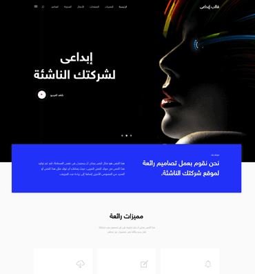
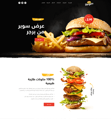
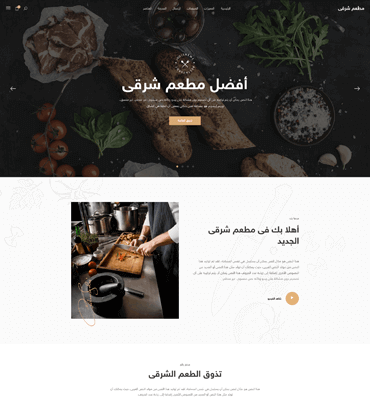
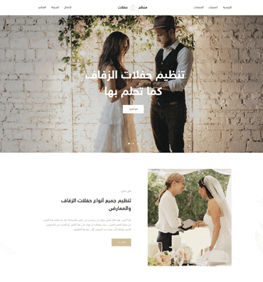
 قالب ووردبريس
x2
قالب ووردبريس
x2
 تصميم جديد
x3
تصميم جديد
x3
هما بلغ تعقيد الفكرة؛ فإنّي أرى أنّ تبسيطها حتمي. الفكرة قبل أن تتحوّل إلى منتج، أو حتّى قبل أن تنفّذ؛ ينبغي أن يحدّد عنصرها أو عَناصرها الأهم.
April 10, 2018

April 14, 2018
لا أخفيك أنّي أحب تصفّح الويب من جهاز الحاسوب؛ لكن هذا لا يجعله مفضّلاً و مقدّمًا دائمًا.
The checkbox class is a simple wrapper around the <input type="checkbox"> HTML element. It is intentionally not styled, to preserve cross-browser compatibility and the user experience.
                        <label class="checkbox">
                          <input type="checkbox">
                          Remember me
                        </label>
You can add links to your checkbox, or even disable it.
                        <label class="checkbox">
                          <input type="checkbox">
                          I agree to the <a href="#">terms and conditions</a>
                        </label>
                        <label class="checkbox" disabled>
                          <input type="checkbox" disabled>
                          Save my preferences
                        </label>
                       <div class="field">
                          <input class="is-checkradio" id="exampleCheckbox" type="checkbox" name="exampleCheckbox" checked="checked">
                          <label for="exampleCheckbox">Check me</label>
                        </div>
Use is-rtl to display a right-to-left design of checkbox or radio (text at left)
                       <div class="field">
                          <input class="is-checkradio is-rtl" id="exampleRtlCheckbox" type="checkbox" name="exampleRtlCheckbox" checked="checked">
                          <label for="exampleRtlCheckbox">Check me</label>
                        </div>
Don't forget to set the id attribute on input and the for attribute on label with the same value to get it work. This will link the label to the checkbox and then handle the click.
You can add the has-background-color modifier to the input to get the checkbox background color impacted
Adding the has-no-border modifier to the input will remove the checkbox border