layout

The structure of your webpage

container


The .container class can be used in any context, but mostly as a direct child of either:

  • .navbar
  • .hero
  • .section
  • .footer

The containers width for each breakpoint is the result of: $device - (2 * $gap). The $gap variable has a default value of 32px but can be modified.

This is how the container will behave:

  • on $desktop it will have a maximum width of 960px.
  • on $widescreen it will have a maximum width of 1152px.
  • on $fullhd it will have a maximum width of 1344px.

The values 960, 1152 and 1344 have been chosen because they are divisible by both 12 and 16.

This container is centered on desktop.


                        <div class="container">
                          <div class="notification">
                            This container is <strong>centered</strong> on desktop.
                          </div>
                        </div>


Fluid container

If you don't want to have a maximum width but want to keep the 32px margin on the left and right sides, add the is-fluid modifier:

This container is fluid: it will have a 32px gap on either side, on any viewport size.


                        <div class="container is-fluid">
                          <div class="notification">
                            This container is <strong>fluid</strong>: it will have a 32px gap on either side, on any
                            viewport size.
                          </div>
                        </div>


Breakpoint containers

With the two modifiers .is-widescreen and .is-fullhd, you can have a fullwidth container until those specific breakpoints.

This container is fullwidth until the $widescreen breakpoint.


                        <div class="container is-widescreen">
                          <div class="notification">
                            This container is <strong>fullwidth</strong> <em>until</em> the <code>$widescreen</code> breakpoint.
                          </div>
                        </div>


This container is fullwidth until the $fullhd breakpoint.


                        <div class="container is-fullhd">
                          <div class="notification">
                            This container is <strong>fullwidth</strong> <em>until</em> the <code>$fullhd</code> breakpoint.
                          </div>
                        </div>


Niche Templates

Joo - Niche Multi-Purpose HTML Template
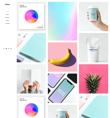
Creative 01
View more
Joo - Niche Multi-Purpose HTML Template
Corporate 01
View more
Joo - Niche Multi-Purpose HTML Template
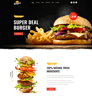
Burger Restaurant
View more
Joo - Niche Multi-Purpose HTML Template
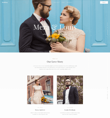
Wedding
View more
Joo - Niche Multi-Purpose HTML Template
Corporate 02
View more
Joo - Niche Multi-Purpose HTML Template
Barber Shop
View more
Joo - Niche Multi-Purpose HTML Template
Logistics Cargo
View more
Joo - Niche Multi-Purpose HTML Template
Restaurant 01
View more
Joo - Niche Multi-Purpose HTML Template
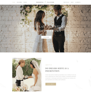
Wedding Planner
View more
Joo - Niche Multi-Purpose HTML Template
Logistics Cargo 02
View more
Joo - Niche Multi-Purpose HTML Template
Creative 02
View more
Joo - Niche Multi-Purpose HTML Template active
Bridal Dresses
Joo - Niche Multi-Purpose HTML Template
Coming Soon
View more
Joo - Niche Multi-Purpose HTML Template
Creative 03
View more